Key Takeaways
- Understand the basics of color theory to create cohesive and functional palettes, balancing warm, cool, and neutral tones effectively.
- Light colors make small apartments feel more open and airy, while dark shades, when used sparingly, add depth and contrast.
- Accentuate your space with pops of color through decor, furniture, or accent walls without overwhelming the overall design.
- Consider the mood and function of each room when selecting colors, aiming for calm tones in bedrooms and warm hues in dining areas.
- Stick to a cohesive color scheme using a maximum of three main colors to ensure flow and harmony throughout the apartment.
- Avoid common mistakes such as overloading with too many colors, neglecting lighting conditions, or excessively using dark shades without balance.
Choosing the right color palette for a small apartment can feel a bit overwhelming, but it’s also one of the most exciting parts of making your space feel like home. The colors you pick don’t just set the mood—they can also make your apartment look bigger, cozier, or more vibrant, depending on what you’re going for. It’s amazing how much impact a few shades can have!
Understanding the Basics of Color Theory
Color theory lays the foundation for creating the ideal palette for a small apartment. Colors are divided into three main categories: primary (red, blue, yellow), secondary (green, orange, purple), and tertiary (blends like teal and magenta). Understanding how these interact helps craft a cohesive look.
Warm colors, such as reds and oranges, create energy and intimacy but can make a space feel smaller if overused. Cooler tones, including blues and greens, promote calmness and openness, making them great for compact spaces. Neutral shades, like whites, grays, and beiges, provide balance and versatility, allowing accent colors to shine.
Light reflects color differently depending on the room’s orientation and lighting. For instance, natural light from a north-facing window may make colors appear cooler, while southern exposure can intensify warmer shades. Recognizing this helps align the palette with the apartment’s natural features.
The color wheel is a helpful tool for combining hues. Complementary colors, like blue and orange, add contrast and vibrancy, while analogous schemes, such as green, blue, and teal, create harmony. Monochromatic palettes, which use variations of a single color, offer simplicity and work well in smaller spaces.
The Impact of Colors in Small Spaces
Colors play a huge role in how a small apartment feels and functions. The right hues can make compact spaces seem larger, brighter, and more open, while the wrong choices might make them feel cramped or overly busy. I’ve spent years transforming small apartments, and understanding how colors affect perception is key to maximizing space.
Light vs. Dark Colors
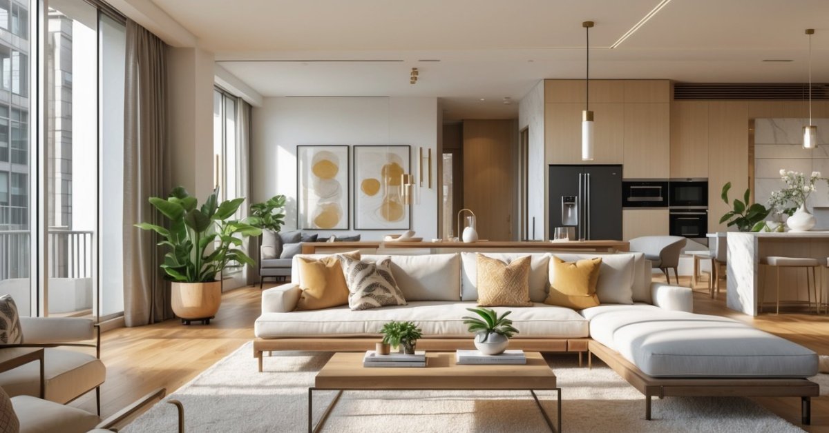
Light colors brighten a small space, reflecting more natural and artificial light, which can make the walls appear farther apart. Shades like soft whites, light grays, and pale pastels create an airy, open atmosphere. For example, I use warm white on walls paired with light gray furniture to add depth without overwhelming the space.
Dark colors, when used sparingly, add contrast and sophistication. In a small apartment, a dark accent wall—like navy blue or charcoal gray—can give the illusion of depth but should balance with lighter tones. I once painted a kitchen wall a deep green to highlight light wood cabinets, which created a cozy yet polished look. Always consider room size and lighting when selecting darker shades, as too much can weigh the space down.
Warm vs. Cool Colors
Warm colors create an inviting and energetic vibe but can make a space feel smaller if overdone. I incorporate warm tones like terracotta, soft oranges, or dusty pinks in decor or accent furniture, rather than covering entire walls. For example, I often use throw blankets or cushions in these shades to add personality without overwhelming the apartment.
Cool colors project calmness and openness, perfect for small rooms or areas where you want to relax and recharge. Tones like light blue, mint green, or lavender work well for bedrooms or bathrooms. In one small studio I renovated, I painted the main living area in a cool gray with blue undertones and paired it with white trim to strike an elegant, serene balance.
Tips for Choosing a Color Palette for a Small Apartment
Choosing the right color palette sets the tone for a small apartment. I’ve worked on countless flips and designed spaces where every square foot counts, so I know how much of a difference the right colors can make.
Start with a Neutral Base
I always recommend starting with neutral tones like soft whites, beiges, or light grays. These colors create a clean backdrop that makes the space feel open and airy. They also work well with any natural light the apartment gets, helping to maximize brightness. For example, in one small studio I remodeled, I chose a warm off-white for the walls, which made the space feel seamless and inviting. Neutral walls make it easier to layer in other colors without feeling overwhelming.
Use Accent Colors Strategically
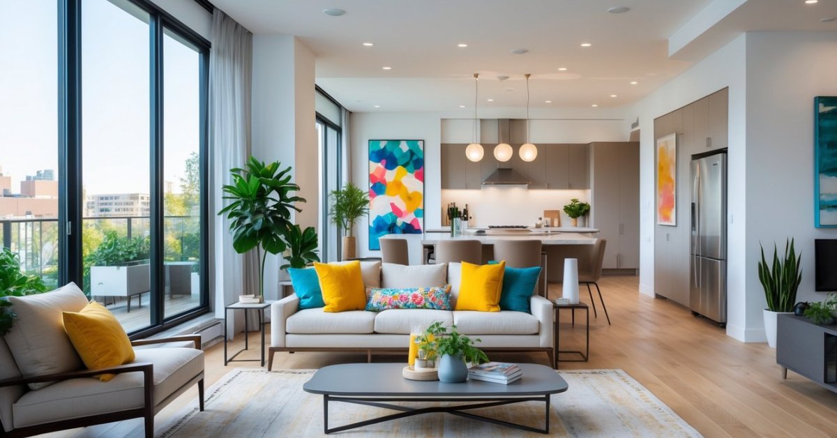
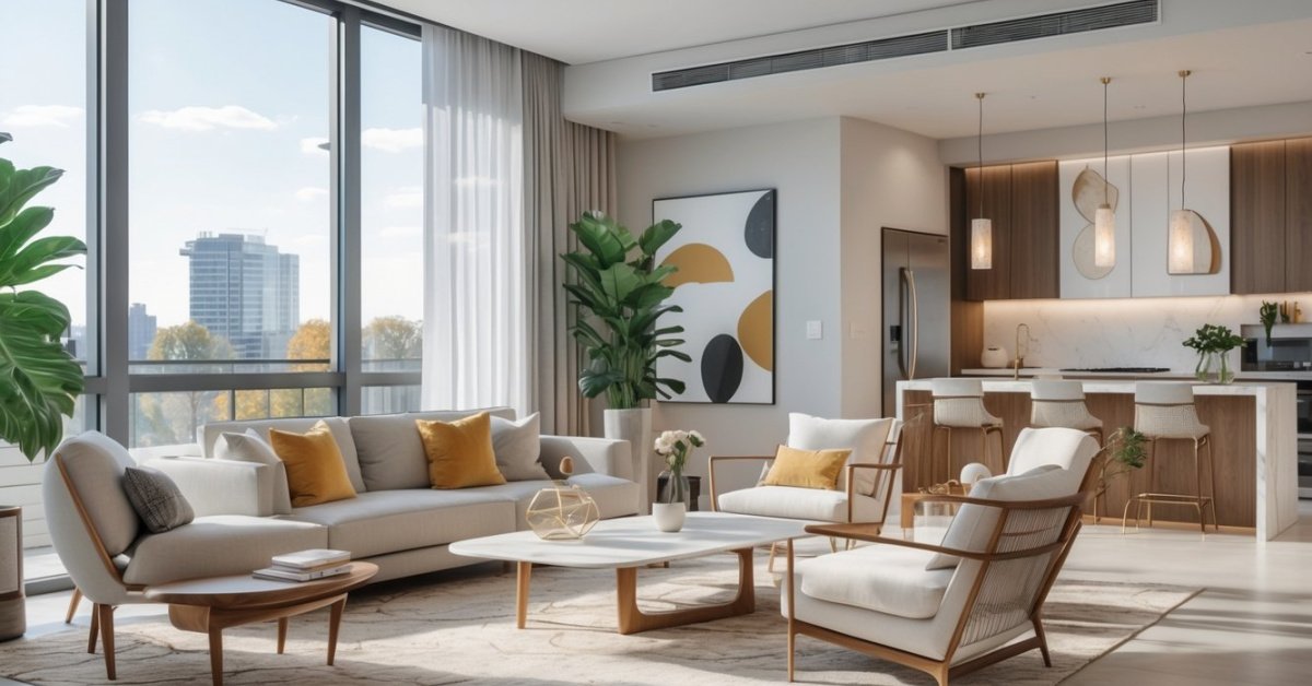
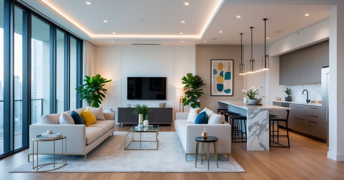
Accent colors can add personality without cluttering the look of the space. I love using them for small details like throw pillows, rugs, or wall art. In a compact living room I designed recently, I used mustard yellow and navy blue accents against a neutral backdrop. This brought in energy and visual interest while keeping the overall design cohesive. An accent wall can also work if the apartment has one specific area you want to highlight, like a nook or an alcove.
Consider the Mood You Want to Create
Think about the atmosphere you want each room to have. Light blues and greens create a restful vibe, which is great for a bedroom. On the other hand, warmer tones like terracotta or deep orange can make a dining area feel cozy and inviting. I once designed a small one-bedroom where I used soft sage green in the bedroom for relaxation and a muted coral in the dining space, balancing calmness with warmth. Picking the right mood for each color ensures the apartment feels both functional and welcoming.
Popular Color Palette Ideas for Small Apartments
Color palettes can completely transform small apartments, making them feel more open, cozy, or vibrant. Over the years flipping properties, I’ve seen certain color schemes work wonders in compact spaces. Below are some tried-and-true strategies I rely on.
Monochromatic Schemes
Monochromatic palettes use varying shades, tints, and tones of a single color to create a harmonious and spacious look. I often recommend light neutrals like soft gray or beige for walls. These colors reflect natural light beautifully, enhancing openness. To keep the design from feeling flat, I layer textures and materials—think gray walls with a medium-tone gray couch, lighter curtains, and darker throw pillows. Using one color family throughout makes the apartment feel cohesive without overwhelming the eye.
Contrasting Color Combinations
High-contrast palettes can add energy and sophistication to a small apartment when done thoughtfully. One of my favorite combinations is navy blue with white. Darker colors, when confined to accents like a statement wall or kitchen cabinets, provide depth without making the space feel cramped. Pairing these dark tones with crisp whites ensures the overall effect remains fresh. Other great examples include a black-and-white theme with metallic accents or dark green paired with warm wood tones.
Pastel and Soft Hues
Pastels and soft shades make spaces feel light and airy, great for compact apartments. Colors like pale blue, blush pink, or mint green create a calming effect while maintaining brightness. I often suggest painting walls pastel and using neutral furniture for balance. For a recent project, I paired a mint green accent wall with a beige sofa and natural wood shelves. These hues amplify natural light and add character without overpowering the room. Pastels also work well in accessories like throw blankets and vases for subtle color pops.
Common Mistakes to Avoid
Choosing a color palette for a small apartment requires thought and care, and some missteps can make the space feel smaller or cluttered. Here are mistakes I see often and how to avoid them.
Using Too Many Colors
Overloading a small apartment with multiple colors can overwhelm the space. I recommend sticking to three main hues—one neutral, one primary, and one accent. For example, pairing soft white walls with navy furniture and brass accents keeps things simple yet dynamic.
Ignoring Lighting Conditions
Choosing colors without considering the room’s natural and artificial lighting can lead to unexpected results. I always test paint swatches at different times of the day. For a north-facing room with cooler light, I might suggest warmer tones like beige or soft terra cotta. In a brighter south-facing area, cooler shades balance the warmth.
Skipping a Cohesive Scheme
Lack of a unified color scheme can break the apartment’s flow. I usually design an open-concept apartment around one palette with subtle variations. For instance, warm gray in the living area transitions beautifully to a softer greige in the bedroom.
Using Dark Shades Excessively
While dark tones add depth, overusing them shrinks a space visually. If a client loves darker hues, I integrate them through accents like a deep navy rug or black cabinet pulls rather than painting entire walls.
Forgetting to Incorporate Texture
Flat colors alone can feel dull in smaller spaces. I suggest layering textures, like pairing matte walls with glossy decor pieces or adding natural finishes like woven baskets or wood furniture. This keeps the palette visually interesting without introducing more colors.
Conclusion
Choosing the perfect color palette for a small apartment is all about finding the right balance between functionality and personality. It’s an opportunity to make your space feel more open, inviting, and uniquely yours. By being mindful of lighting, textures, and how colors interact, you can create a home that feels both stylish and comfortable.
Remember, there’s no one-size-fits-all approach. Trust your instincts, experiment with swatches, and don’t be afraid to take creative risks. Your apartment should reflect your style while making the most of its space, so have fun bringing your vision to life!